Menu bar

Drop Down MenusCSS Drop Down MenuPure CSS Dropdown Menu

slide bar

How to make false colored SEM images How to measure nanoparticle size distribution using SEM picture How to organize colors in your scientific drawing How to tune-up the photograph of your sample How to make false colored monochrome SEM image How to combine many SEM images into one figure How to organize colors in your block diagram How to save graphic files for scientific journal

How to combine many SEM images into one figure


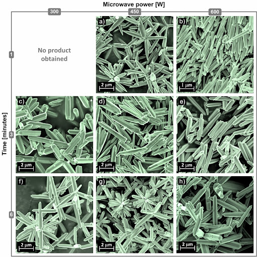
Figures prepared for communication can be designed as a single-panel or as a collection of subfigures arranged in columns and rows, so called multipart or compound figure. Multipart figures are often used to represent SEM (Scanning Electron Microscope) images of samples obtained under various conditions, as it is shown on example figure. Such visualization allows us to present and analyze a complex process of nanoparticle synthesis by its individual products, by relation among products, and by the process itself as a whole entity. From the editorial point of view, each panel of a multipart figure should be precisely adjusted, so that the whole figure looks well arranged. Moreover, each panel should be scaled in order to focus on essential details. However, when scaling, a scale bar dimension has to be calculated and redrawn. The following tutorial divided into two parts shows how to easily reach a high accuracy in arrangement of compound figures.
part 1/2


part 2/2


Download related files:

How to organize colors in your block diagram


Colors play a major role in perception of any kind of graphics. Unfortunately, it is rarely considered by scientists as an element of composition. Presented drawings aim at contrasting the approach of black and white composition, with the approach of random and organized colors. The difference is obvious at a glance. However, finding the right color combinations can be really hard, especially if you want to present complex dependencies. Just because we have a natural ability to distinguish colors does not make us an expert in that field. It is therefore important to use an abstract illustrative organization of color hues such as a COLOR TREE. This simple tool is used by artists and designers, but can be also very useful for scientists in picking colors for their drawings. The following tutorial presents some general guidelines for the proper handling of colors and provides some specific examples to illustrate inappropriate practices. Follow it and create your scientific block diagram with harmonious color combination and an ambience of elegance.


Related files:

MS Visio 2010 sample file

Image gallery:


How to save graphic files for scientific journal


Most of publishers have basically the same recommendations on how images files should be formatted for academic journals. However, if you are preparing an image for a particular publication, check out the journal webpage for submission guidelines to determine what RESOLUTION, PHYSICAL DIMENSION and FILE TYPE they want you to provide. Usually, the minimum required resolution is of 300 dpi. Images are usually printed as either one column wide (8.5 cm, or about 3.35 in) or two columns wide (17.8 cm, or about 7.01 in). One of the most recommended file formats is *.tiff (Tagged Image File Format). All other raster graphics formats are discouraged or not allowed, due to their lossy image compression. Presented drawings aim at contrasting the output graphics saved with various resolutions. The difference may not be obvious at a glance, but check out the next drawing in the album to see magnified view. The following tutorial presents some general guidelines concerning file saving for scientific journals and provides specific examples to handle output graphics with Adobe Photoshop CS3, MS Visio 2010 and MS PowerPoint 2010. Follow it and do not let the quality of your artwork be lost in pixelated, low-resolution images.


Image gallery:


How to organize colors in your scientific drawing


Colors play a major role in perception of any kind of graphics. Unfortunately, it is rarely considered by scientists as an element of composition. Presented drawings aim at contrasting the approach of black and white composition, with the approach of random and organized colors. The difference is obvious at a glance. However, finding the right color combinations can be really hard, especially if you want to present complex dependencies. Just because we have a natural ability to distinguish colors does not make us an expert in that field. It is therefore important to use an abstract illustrative organization of color hues such as a COLOR WHEEL. This simple tool is used by artists and designers, but can be also very useful for scientists in picking colors for their drawings. The following tutorial presents some general guidelines for the proper handling of colors and provides some specific examples to illustrate inappropriate practices. Follow it and create your scientific drawing with harmonious color combination and an ambience of elegance.


Related files:

Image gallery:


How to tune-up the photograph of your sample


The authors of scientific manuscripts frequently supplement experimental details and the results of their investigation with digital photographs. Technological advances have changed the way the photographs of studied samples may be recorded in order to get satisfactory image. However, most of the photographs taken at lab conditions still require some post-processing to make them publication-ready. The following tutorial presents some general guidelines for the proper handling of digital photographs and provides some specific tips and tricks to enhance perception of presented objects. Follow it and simply display your digital photographs in a more visually engaging way. Suggested modifications, however, do not introduce inappropriate changes to your original data, so making such changes will not be classified as scientific misconduct.


Image gallery:


How to make false colored monochrome SEM image


Raw SEM (Scanning Electron Microscope) images induced by electrons are in gray scale because only light carries color information. However, the false monochrome color (containing tones of a single color) can be simply added to micrographs at any time using digital image processing. The way of adding monochrome color to the SEM image using Adobe Photoshop CS3 is presented in following tutorial. Follow it and simply convert your SEM image file into a monochrome scientific artwork with enhanced contrast.


Image gallery:

How to measure nanoparticle size distribution using SEM picture


The nanoparticle size distribution can be determined using numerous commercially available instruments. However, such techniques make very convenient but too simplistic assumption that every particle is a sphere. The following tutorial shows how to describe particles size using multiple length and width measures based on SEM (Scanning Electron Microscope) image. This method provides greater accuracy and allows us to determine surface-to-volume ratio which together with size effects of nanoparticles introduces many size/shape-dependent phenomena such as chemical, electrochemical, electronic, magnetic and mechanical properties. This approach is based on manual measurement of each particle which may be very time consuming. However, it may be the only solution to get accurate particle size distribution and aspect ratio when automated image analysis methods fail (i.e. most cases).


Related files:

Image gallery:


How to make false colored SEM images


Nowadays, for publishing manuscripts in high impact factor journals, SEM (Scanning Electron Microscope) images need to be false colored for enhancing visual illustration. The way of adding colors to the SEM image using Adobe Photoshop CS3 is presented in following tutorial. Follow it and simply convert your SEM image file into multi-color scientific artwork.


Image gallery:

Advertisement